Design Counts – ‘that’ Breton Top
How ironic perhaps that one of my most publicised designs is one so simple.
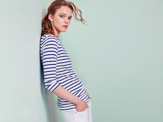
It might be said that it looks like any other striped T-shirt but behind the scenes as with any design that makes into any collection there’s a story to tell behind this particular one for Client ME+EM , and the design details that can be passed over if not explained. Here are a few..
- A slash neckline only suits certain people and there was a lot of convincing to be done before that neckline was approved.
- It’s got little ruches at the waist- that creates a flattering movement at the waist.
- I made it ever so slightly longer so that it does not pull up when you are moving around.
- The slight envelope neck bindings give that little French touch.
- The fit- has to be not restrict but have a perfect armhole.
- The exact stripe design took hours of deliberation and trials- eventually we found a vintage sample which did the trick.
- The jersey fabric – the hand feel weight and construction- whether to do plain jersey or 1×1 rib stitch. For those know don’t know that terminology: the difference is in the hand feel and we opted for the latter as its softer.
- Optic white or natural white, cobalt or navy? Questions and colour conundrums can take days and weeks in a design led business.
- Then the name? I christened it the “Breton” as I’ve always loved J.P.Gaultier’s signature striped T’s so hence was born – the famous ME+EM Breton Top which has launched the brand and will continue attracting customers for years to come.
So there you have it- even with a seemingly simple stripe T shirt , design counts.